Our starting point is Janice's sneak preview of the 2021 scarves in her project. She chose her scarves (all from the brand Echo this year) to represent six commonly requested combinations of neutrals:
#1 Black and Grey
#2 Navy and Beige
#3 Navy and Grey
#4 Olive and Beige
#5 Brown and Grey
#6 Grey and Denim
I tried to find scarves in my collection that include these neutral combinations as well as (at least) 3 accent colors. I knew that my accent color choices would vary from Janice's, as she had picked scarves featuring colors that are not common enough in my closet to adequately clothe the Other Sallys.
Like many people, I have color associations with different seasons, so the idea of creating a year-long capsule wardrobe around a single color palette intrigued me. I see it all the time on the Vivienne Files (which I cannot help but acronymize to TVF), but I've never tried doing it myself. I'm looking forward to seeing how I respond to colors that may have some degree of seasonal association being represented outside that season. Perhaps seeing these year-long wardrobes play out will help weaken those associations. It's funny because I am creating these capsules from my own wardrobe so it's not like I'm suddenly going to see a pair of autumnal pumpkin orange fleece leggings unexpectedly appear in February and say, My goodness, who would have thought such a thing is possible! But I think I'll find that despite these color-season associations, I will have plenty of season-specific items in colors that feel outside that season. Maybe seeing how many of these "out of season color" items I own (and wear) will make the idea of a year-long color palette feel more possible to me.
On to my scarf selections!
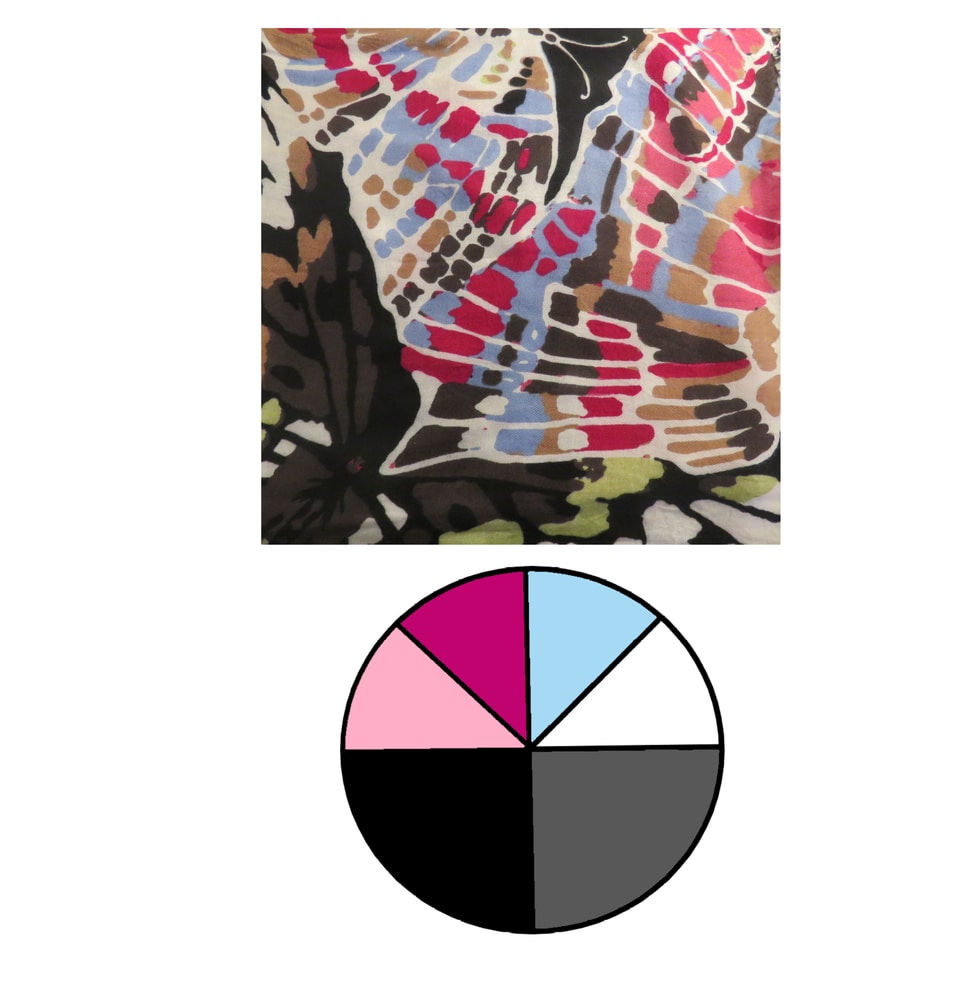
#1 Black and Grey. Her first scarf is the Chrysalis scarf in black and grey. She chose 3 accent colors from the flowers: pink, purple, and yellow/orange. When I looked over my scarves, a large-scale butterfly print with black and grey caught my eye. I had recently worn this scarf as a bridge to connect a grey sweater and brown jeans after seeing a grey/brown capsule on TVF so that seemed fitting. As I ended up doing with most of these palettes, I added white as a third neutral, and then I selected 3 accent colors from the scarf that are well-represented in my closet: pink, bright pink/magenta, and light blue. Light blue is not an obvious addition to a black and white wardrobe, in my opinion, but it's beautiful with grey and black, it's a color I own, and I certainly did not want to try to use that pale lime green color as the third accent! When I look at this color palette, I think late winter reaching into spring.

#2 Navy and Beige. Janice selected the blue floral patchwork scarf that had tempted me, then inspired me to create my own play-along wardrobe. Its accent colors of light blue/aqua, yellow, and coral made my choice extremely simple: a white scarf with a large flower print in light blue/aqua, yellow, and coral! Again, I explicitly included white in the palette (on general principles and because white is the biggest "color" represented in the scarf). I kept the beige neutral in the palette even though it doesn't appear in the scarf; colors in the beige/tan range are not very common in my wardrobe, but I have enough that I thought I could give it a go. To me, these colors are the height of summer.

#3 Navy and Grey. A ruana in shades of purple with navy and white were Janice's atypical choice. She usually selects silk scarves, so the ruana is a bit of a wild card. She included grey in the palette despite it not existing in the ruana, which I think was an excellent decision...and one I ended up mimicking in my choice of scarf and palette. This scarf with a navy background, white foliage, and purple, pink/magenta, and blue birds generates a palette that works very well with grey, even if it appears in the scarf in the most minute amounts. I noted that the flowers are a combination of pink/magenta and a light pink, so I saw the pink/magenta piece of the palette as representing a broader range of pinks than it appears. This palette has less of an immediate season association than the previous two; if I had to categorize it by season, I would say winter and spring, but navy and white is such a stereotypical summer combination that it's really only autumn where these colors feel a little less natural.

My next post will continue with the last 3 scarves and palettes for this project.
I'm finally reading these - sorry for the delay! I do wish your blog template had a 'next/previous' button somewhere. (I can't find it, at least.)
I really like your scarves. Lovely colors.