A Soft Blue Summer Outfit with a High Priority Wear Skirt + DIY Jewelry
- sallyinstpaul
- Aug 16, 2024
- 4 min read
In my last post for the Style Imitating Art (SIA) challenge for this painting by Georges Seurat (improved with rabbit)...

...I shared this outfit in which I combined my tropical leaf top, aloe vera ankle pants, and soft blue cardigan for the first time. I was really pleased with how well these three pieces worked together, and it made me wonder whether I had paired the top with soft blue before.

A quick look at my outfit spreadsheet revealed that I had done so at the beginning of this summer when I wore the top with my slate blue thrifted MM LaFleur skirt, which has been one of my high priority wear pieces for summer 2024 as it was last summer. (I have worn it four times so far this summer, which may not seem like much, but it's brought my total wears to 21 and my cost per wear to $0.96, under my $1 goal!) Although a soft blue color appears in the top's print, it is in small enough amounts that it was not an obvious color pairing for the top; I tend to pull out the navy, olive, and burgundy colors instead. But now that I've worn two outfits including this top and a solid soft blue piece and have loved both, I am sold on the combination!

I think identifying high priority wear items can be a great strategy as either the basis of or as an alternative to a seasonal capsule wardrobe, but you can also use this methodology in a much more limited and focused way to create new outfits from your existing closet. Try pulling out just one or two items that you'd like to wear many times in the current/coming season and test these items with everything in your closet in compatible categories. For a skirt, put it up against every top and every topper piece in your wardrobe; for a top, try it with every bottom and every topper piece; etc. You'll find some combinations that are obviously compatible. Others may be iffy, but it can fun and educational to see if you can introduce other pieces that pull an outfit together.
I love that identifying high priority items pushes me to experiment with combining things I probably would not otherwise have tried because I am looking for as many options as possible for the high priority piece. It also makes me try putting multiple high priority items together in an outfit...which can lead to laughable looks, sure, but occasionally you strike gold with an unexpectedly great combination. Perhaps you'll even discover a new Pleasing Pairing that you can wear again and again in different outfits.
Because of the cool undertone of the blue skirt, I decided to wear a cool-toned version of a nude(ish)-to-me shoe with it. Yes, blush pink is my true nude to me color!

I initially was going to wear this outfit with a pale grey cardigan, but it was so warm that day that the only layering I wanted was my necklaces. As I did in the recent SIA outfit above, I wore my slate blue/silver adjustable necklace from CJ Banks, but the other two necklaces are different. The short one has gorgeous dark blue lapis lazuli beads with small garnets and gold spacers, made for me about 30 years ago by my friend RB. The long silver pendant is another piece I bought from CJ Banks. This summer I've been wearing this basic layered necklace formula on repeat: short necklace above the neckline + mid-length necklace below the neckline + long pendant necklace.

I leaned into the cool-toned colors with my daily bracelet stack, starting with a paper bead bracelet set in shades of soft blue, white, grey, and silver. I filled up the stack by adding a variety of beaded bracelets in light blue and silver combinations. {stretch bracelet tutorial} {bicone paper bead tutorial}

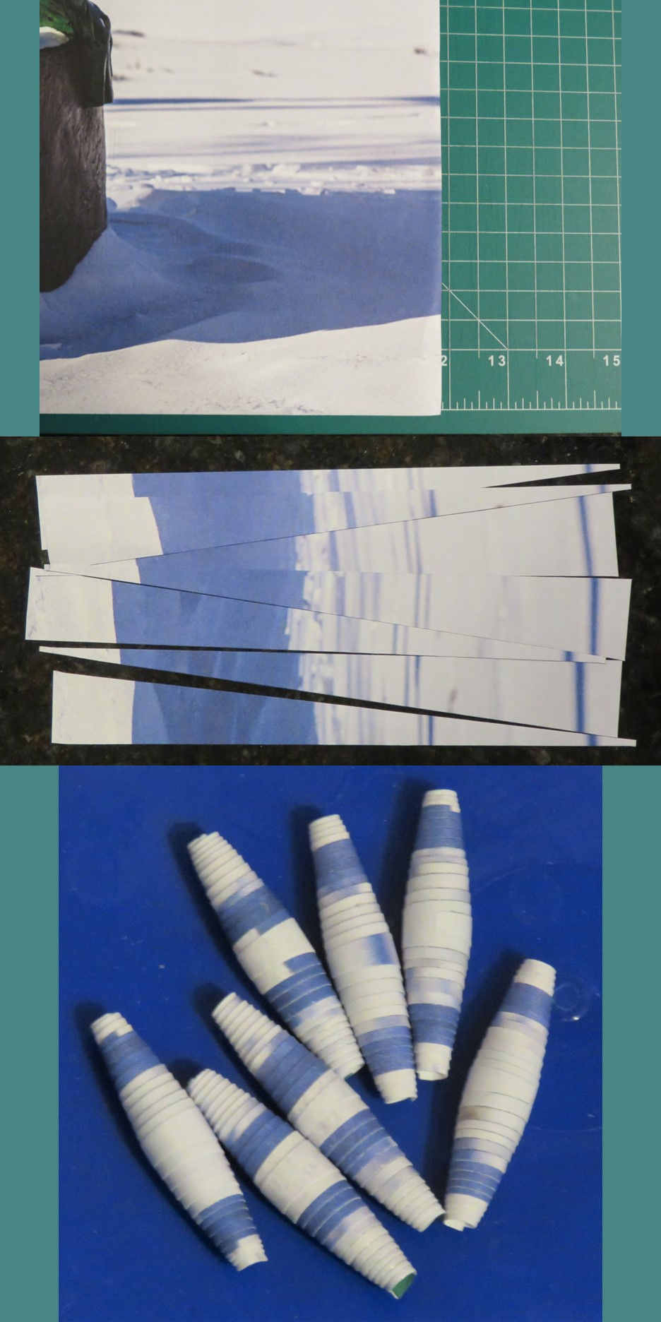
The top paper bead bracelet (third from the top in the stack) was made from an image of bright and shadowed snow in an alumni magazine. I ignored the part of the page at the left and cut my strips from the blue and white area at the right. I love that the resulting beads retain something of the cool crisp vibe from the colors. Appropriate for winter and aspirational for summer...a winner in any season.
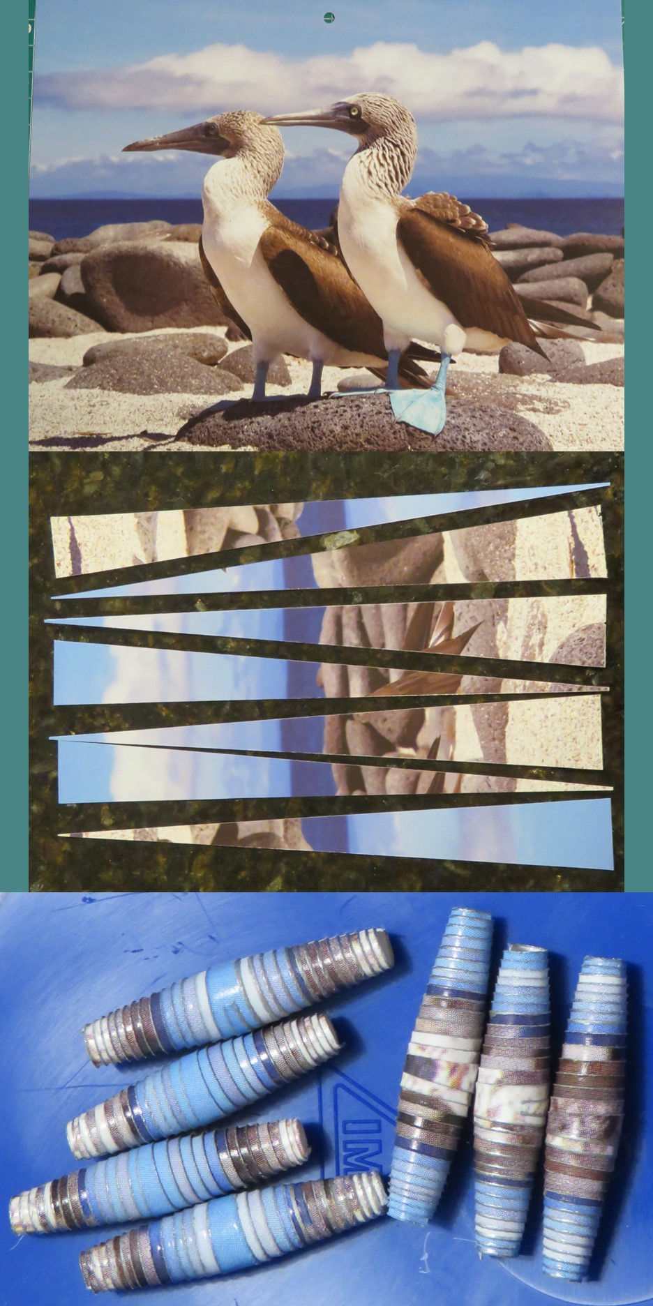
The second paper bead bracelet (fifth from the top) started out as this image of a pair of blue-footed boobies on a calendar page. It's interesting to notice how my sense of the neutral colors changes from looking at the full image to the beads. When looking at the calendar page, my attention is drawn to the birds and I notice all the brown of their wings and kind of ignore the background, which actually has quite a lot of grey from all those rocks. When looking at the beads, I don't have a focal image grabbing my eye - I just see the range of colors that exist on the paper. So while the original image looks more brown to me, the rolled beads look more taupe/greige. When selecting paper for making paper beads, it's good to remember that certain elements that are very attention grabbing in the original might factor in much less in the rolled beads. But not knowing exactly how a paper is going to translate into a bead is a big part of why I love this craft!

As befitting the wintry origins of my paper bead bracelet set, I kept the cold icy theme going in the corresponding bead soup stack earrings. The blue faceted crystal beads and rhinestone spacers at the bottom of the earrings have a particularly sharp icy feel, the white glass pearls have a snowy luster, and the delicate silver bead caps remind me of curved shapes you see in wind-blown snow.


Do you have any pieces that are high priority wear items for you this summer or for the coming fall? Are there any pieces that you've been wearing repeatedly this season? Do you like to wear muted blue colors? Or do you prefer brighter, lighter, or darker blues? Do you ever wear things with cool temperature associations in the summer heat?
Blogs I link up with are listed here.
The Jacquet Droz mythology is one that dates back to the 1700s, and today's watch – link the Grande Seconde Email Ivoire J014013201 link – is inextricably tied to that mythology as the Grande Seconde display is one that harkens back to the historical watchmaker himself who developed t in order to emphasize the fast pace link of urban life in Europe during the Enlightenment. We'd venture to guess there aren't many "enlightenment-inspired" watches out there these days.
What a good idea, Sally, to hold a high priority item up to everything to see if it works! I try to make sure everything in my closet has at least three items to work with it. But, your way would create many more ways and may be even more fun!
https://marshainthemiddle.com/
My high priority items are usually the ones I like (which is why they are still in my closet) but I don't reach as often as others. I have done a good job of doing that this summer I think. I do wish I had a spreadsheet like you to do my cost per wear because I love that sort of data!
www.chezmireillefashiontravelmom.com
Haha, I really had to laugh about the rabbit in the painting! Much better! Love the colours in these outfits!